
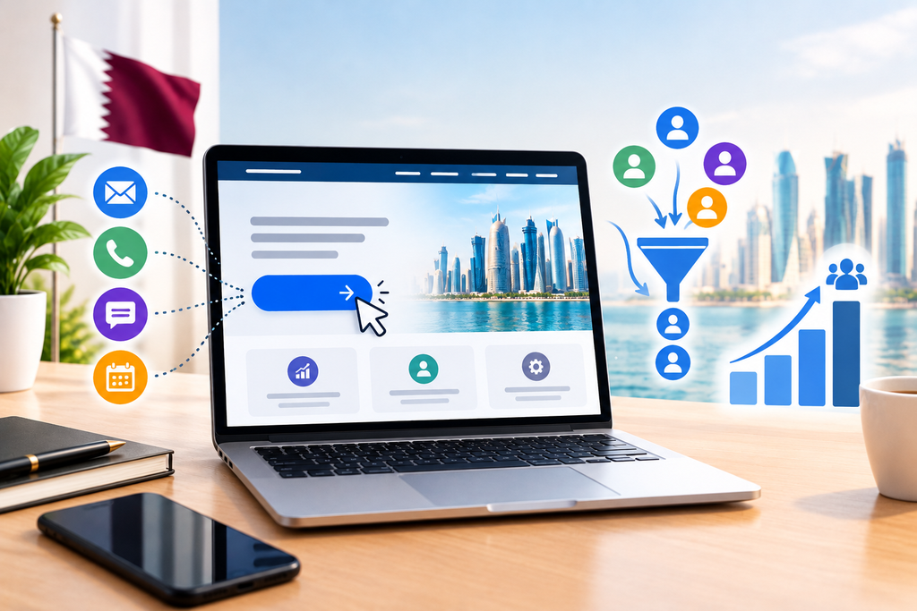
Customers may visit your website and be interested in your service, however they may be unsure what to do. They may wish to get a quote, book a meeting or ask a question. If you don’t provide them with any guidance they may become lost and move onto another site.
Having call to action buttons can help your business in Qatar create a more user friendly site as they help to guide users on what to do.
What Is A Call To Action Button?
A call to action button is a clickable button that helps push users to take an action. These can include;
Get A Quote Contact Us Book A Consultation Find Out More Shop Now
Every button should have a specific purpose. For example if your business provides professional services you could use a ‘Get A Quote’ button. If you run a restaurant you could use a ‘Book A Table’ button.
Where Should You Place The Button?
Where you place the buttons can impact how easy they are to find. Consider adding them to key areas;
Homepage – Provide users with guidance on how to contact you or what services you provide.
Service Pages – Encourage interested users to get a price or talk about their requirements.
Landing Pages – Provide users with a clear action to take after reading about the offer.
Contact Page – Make it easier to complete an enquiry, book a meeting or ask for a callback.
Ensure the buttons are not too intrusive.
Use Clear And Simple Language
Users should know what will happen when they click the button. Using generic terms such as “Click Here” may not provide enough guidance.
Use language that will help the user. For example “Get A Free Quote” tells them what they will get and “Talk To Our Team” provides them with a clear action.
Depending on what service you provide and what you want the user to do, use appropriate language. Don’t make any guarantees that you can’t provide.
Ensure Buttons Are Easy To Use On Mobile
Many users will visit your business website using their phone. If the buttons aren’t large enough, easy to click or are placed amongst other items they can become frustrating to use.
Ensure the buttons are easy to see, the text is clear and can be used on all screen sizes. If your business in Qatar gets enquiries via phone or WhatsApp then making it easy to contact you will also improve the user experience.
Common Mistakes To Avoid
If your website isn’t designed well your buttons may not be effective and cause you to lose potential enquiries. Common mistakes to avoid are using unclear text, colours that don’t stand out, placing them in hard to find places and linking them to broken links.
Too many buttons can confuse users. Ensure the key action is clear.
Monitor Button Use And Enquiries
Whilst adding buttons to your site is the first step, it’s important to ensure users are using them.
Using website analytics can help you see how many times the buttons are clicked, how many forms are filled in and other key actions. This can help you see which pages are encouraging users to enquire.
If your service page is being viewed but the contact button isn’t being clicked often then you could look at changing the location, text or content around the button.
Final Thoughts
Whilst call to action buttons might appear to be a small part of your website design they help users to know what to do. By ensuring they have clear text, are placed in the right area and are mobile friendly it can make it easier for potential customers to contact your business.
Ready to Get Started?
Orbition X builds WordPress websites, Shopify stores and landing pages from Doha. See our web development service or book a call and we will scope your project and give you an itemized quotation.